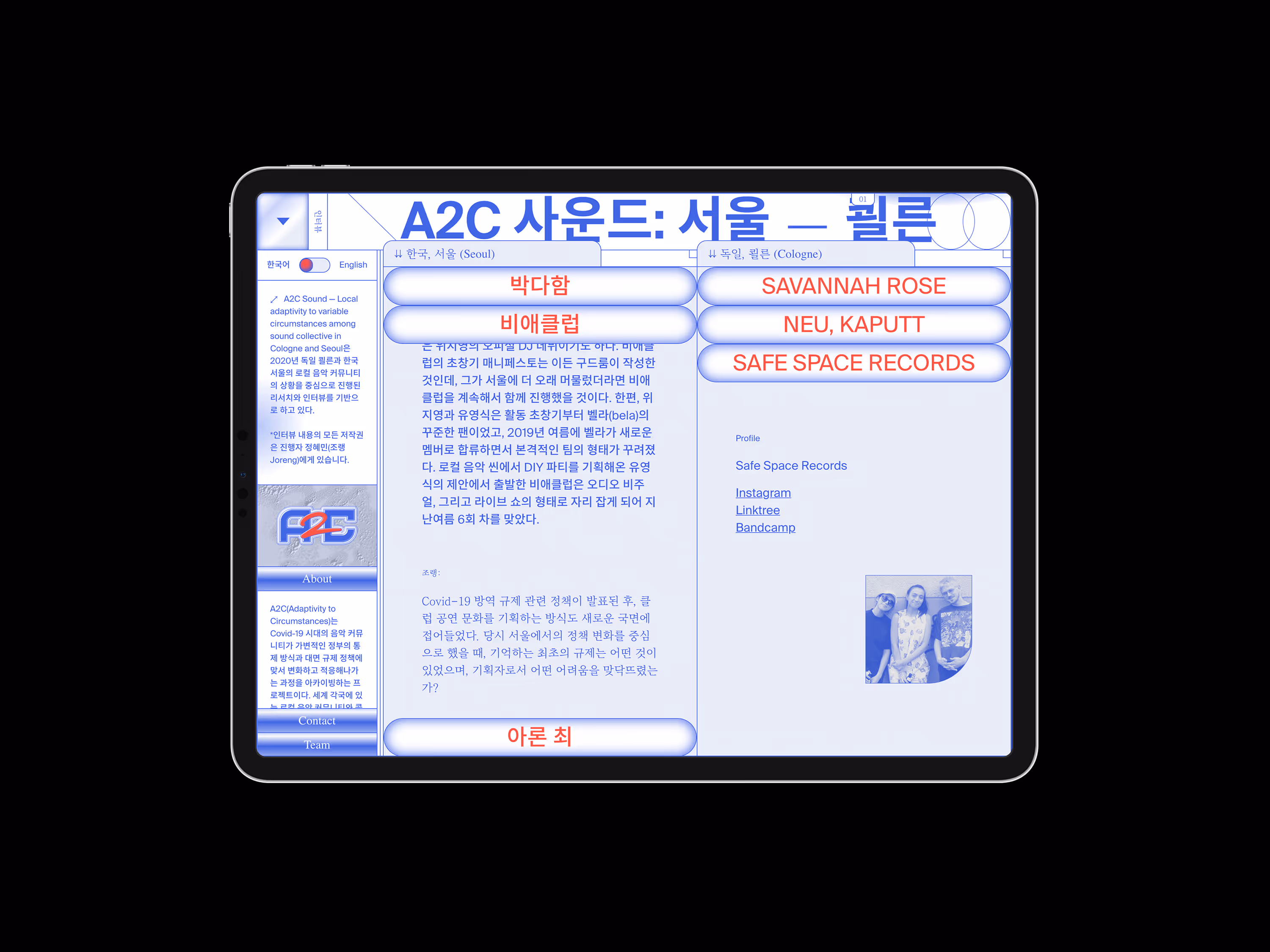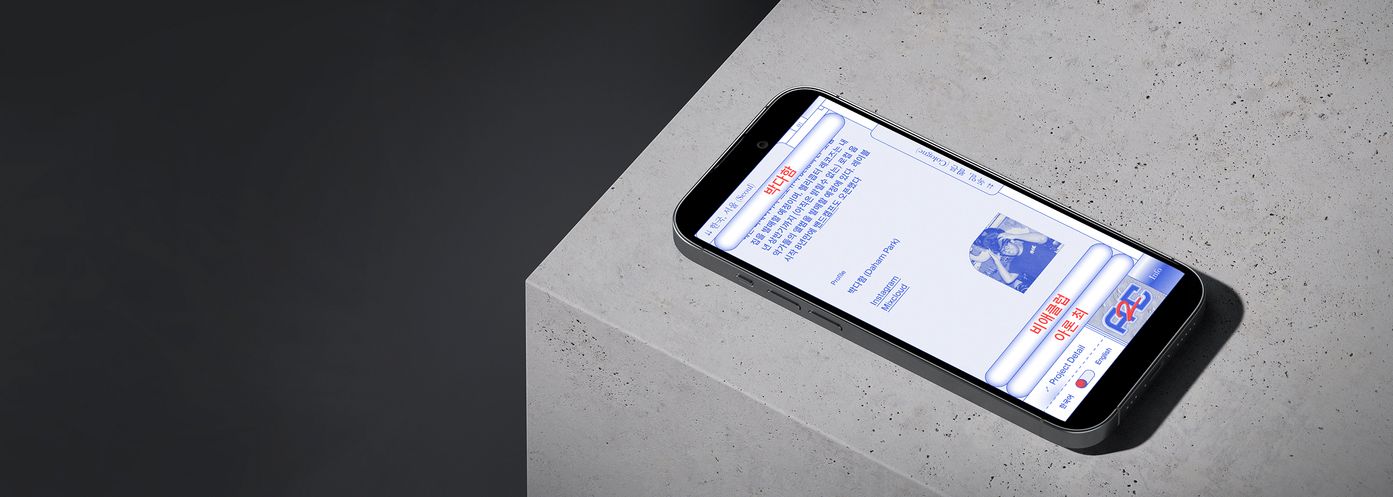
A2C (Adaptivity to Circumstances) Sound archives how local music communities and collectives in various world cities reacted to and adjusted towards variable regulations and situations during Covid-19. I was asked to create a visual identity for the project and a website to archive the information and content.
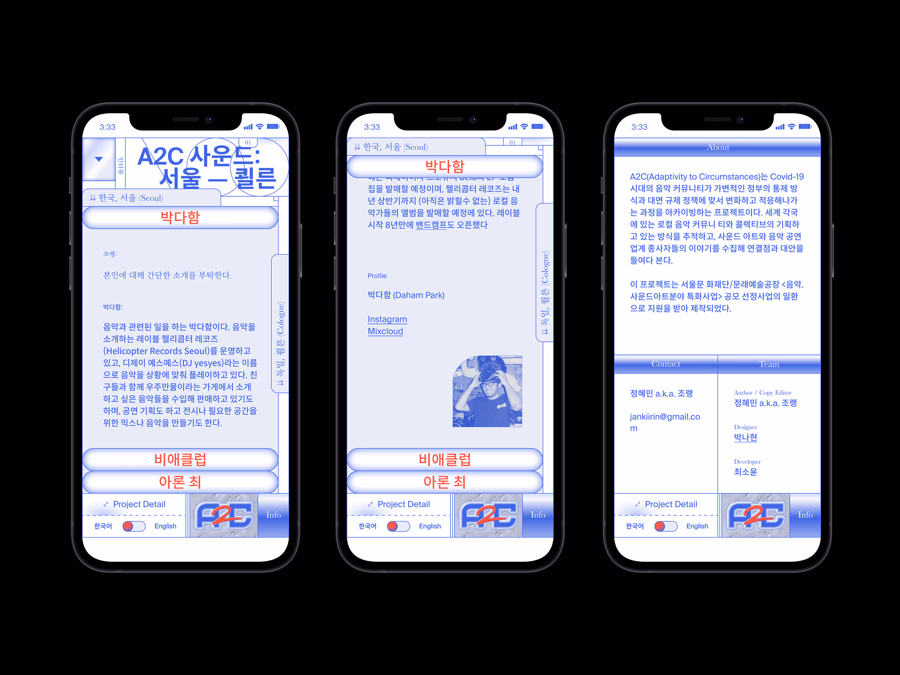
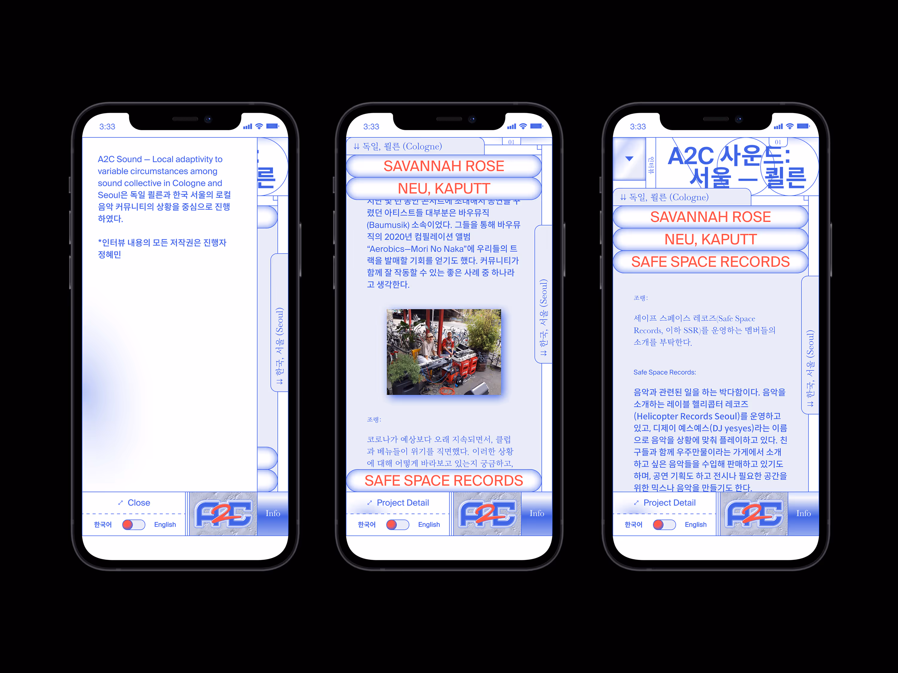
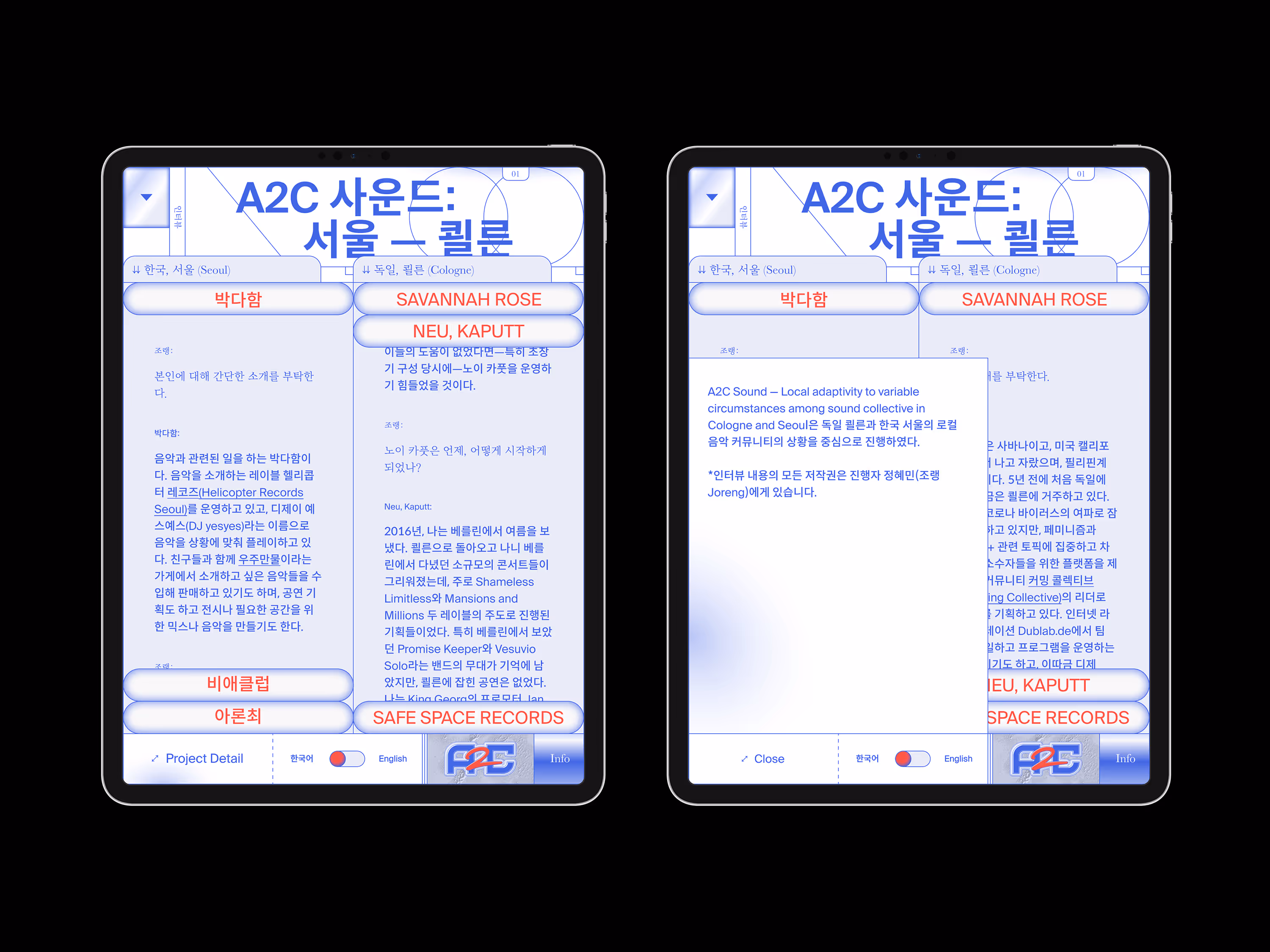
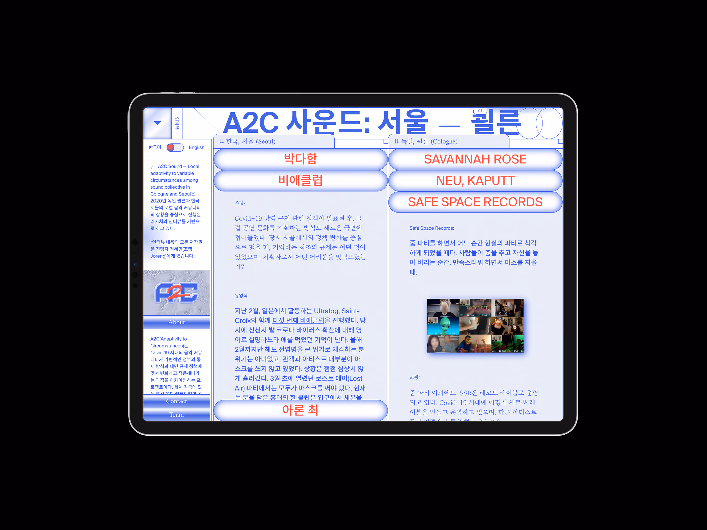
The project compares the music industry in two different cities — one in South Korea and another country — by interviewing local people who are involved in sound art and performance. The project’s overall visual direction contains both a formal and playful look with twisted analog imagery referencing archival reports and research. It mixes textures such as a paper document with a retro internet world. I created the digital version's faded texture using CSS gradient. I used the accordion aesthetic to open and close sections, which signals towards the experience of using the fingers to search through physical document files. For a better user experience of a content-focused website — and to minimise steps — all the information is shown directly on the landing page in a brutalist style. The latest subject is displayed on the landing page and can be changed by clicking the drop-down menu on the top left corner. To maximise the fundamental purpose of the project — comparing and connecting two cities — I set up the concept as a mirrored structure and applied it to the website and the logo. A double scroll layout shows two different contents on one screen; a chain-symbolised logo with the letter A and C looks as though it is reflected. The interviewee's portrait photos are also in each mirrored chain shape. To present the interview content effectively, I applied a strong contrast between the interviewer's and the interviewee's words using different weights and styles of font to suggest two different voices talking.
* The second project and the English version are in progress.